
Prior to the 2021 season, the NHL announced each team would be debuting a new alternate uniform. The Reverse Retro program gives each franchise an opportunity to give the fans something new while also generating some extra revenue for the league. The Idea with this program is for each team to take elements from different jerseys throughout its history, including but not limited to, logos, colors, fonts and stripe patterns. These elements are then combined into a completely new or unique jersey. Some teams have done simple color inversions while others have gotten little more off the path.
In this new series, we’re going to break down each team’s new uniform set by division, give some background information and provide some of our own thoughts as well. With the Blackhawks debuting their new duds during Sunday’s victory against Detroit, what better way to kick off this series than with the Central Division?
Chicago Blackhawks
Based on: 1948-51 white home jersey
For a team that has kept their look largely the same for many years, the Hawks have had quite a few specialty jerseys from throwbacks to outdoor games and more. For their Reverse Retro set, they decided to keep it mostly simple, using their 1948-51 home sweater as the base. The jersey was originally worn by hall of farmers such as Bill Mosienko and Roy Conacher. Aside from inverting the white to black, additions such as player names and sleeve numbers were made. The block font remains and we see the return of the classic circle crest that you may remember from their 2009 Winter Classic sweater.
Grade: B+
Something tells me these will forever be burned into fan’s brains, as their debut coincided with a particular player reaching a particular milestone. While somewhat subtle, it’s nice to see the Hawks have a black jersey in the mix. The red shoulder yoke and striping gives it enough color to make it interesting. Red trim on white numbers always pops on a black sweater and the old school crest is a nice look. We haven’t seen it in 10 years, after all. While I was hoping for the barber pole striped counterpart to be the basis for this sweater (which would’ve made this jersey an A+ for me), I’m not complaining with what we got. I’m still not sure which one I’m going to order … No. 8 or 12 could look pretty nice on the back of this one.
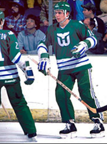
Carolina Hurricanes
Based on: 1979-83 Hartford Whalers white home jersey
The Canes dug deep into their franchise history for their Reverse Retro set, leaning on the classic Whalers look worn by legends such as Gordie Howe and Ron Francis. Dating back to 2018, Carolina has been wearing the 1985-91 green Hartford throwback for select games. This time, they went with its predecessor, which features their mascot, “Pucky” the whale on the shoulders. The jersey was changed from white to grey, a color Hartford used in their uniforms from ‘92-’97, before moving to Raleigh. They also avoided the use of the famed “Cooperalls.”
Grade: B-
It may be a bit controversial for some, seeing the Hurricanes rock the old Whalers uniforms. I’m personally all for it. The only thing that was ever really good about the Hartford franchise was its logo and uniform. My issue here is with the use of the color grey. The league designated it as a dark jersey which, like we saw in their Feb. 19 game against the Blackhawks, makes it pretty boring to watch when they’re playing a team wearing white. It might’ve worked better as a light jersey or flipping it around to be primarily blue. I already dished out for the green adidas retro, so this is a pass for me. It gets a B-minus for the overall look of the Hartford jersey and of course, for bringing back Pucky!
Columbus Blue Jackets
Based on: 2002-07 white away jersey
Celebrating their 20th anniversary this season, The Blue Jackets don’t really have that deep of a history to pull from. Their mid-2000s white jersey, most famously worn by Rick Nash, was inverted to create the team’s first ever red uniform. Aside from the color swap, the Jackets’ Reverse Retro jersey stays true to the sweater that inspired it.
Grade: C
Columbus doesn’t really have much to choose from. Even so, this jersey leaves a lot to be desired. While I commend them for adding a red sweater into the fold, The alternate jersey from this era would’ve been a much better choice for the base design. The original Jackets logo is dated and gaudy. The white shoulder yoke is a bit jarring in contrast to the red sweater and navy helmet. Also, the red top and blue pants give this look a ‘Capitals-esque’ vibe that I can’t un-see. It’s not the worst attempt a team has made, but it could also be a lot better.
Dallas Stars
⚪⚪⚪#ReverseRetro | #GoStars pic.twitter.com/SY9lWzpliZ
— Dallas Stars (@DallasStars) February 15, 2021
Based on: 1999-2006 home and away jerseys
A year removed from a Stanley Cup Final appearance, the Stars decided to model their Reverse Retro sweaters after the ones worn by the likes of Mike Modano and Brett Hull in their ‘99 Championship season. However, almost all of the color was stripped from the original design, leaving a primarily white jersey, with silver and victory green trim. To complete the look, Dallas opted for white helmets, pants, socks and gloves.
Grade: F
Dallas really missed the boat here. They completely negated the idea behind the “big star” jersey design by striping away the color from the actual star striping. You can’t make a minimalist jersey out of a busy 90’s design. This was such a missed opportunity to create a victory green version of the big star or even a black one. And to make it worse, they made the entire uniform white. This is the most boring look a team can have when you play on a white sheet of ice. At least you can see the numbers on the back, but that’s not much of a saving grace. The far superior original green version (of which I have one featuring Joe Niewendyk) deserves better treatment than this.
Detroit Red Wings
#ReverseRetro x #LGRW pic.twitter.com/jEUDjqbSsP
— Detroit Red Wings (@DetroitRedWings) November 16, 2020
Based on: 1934-56 white away jersey
Detroit has been known to keep things simple when it comes to their branding and their Reverse Retro uniform is no exception. Their first change kit was used as the primary concept, the most noticeable change being the red sleeve and tail stripes being swapped to light grey. The team added player names and enlarged the crest to complete the look. While a mostly conservative design, this jersey was worn by many Hall of Famers, such as Gordie Howe, Ted Lindsay and Red Kelly … you may have heard of them.
Grade: D
Much like Homer Simpson’s feelings for Ned Flanders, I detest the Red Wings. For most of my life, I had to see them regularly use the Hawks as their personal punching bag. However, when it comes to jerseys I am fair and objective. Detroit has some eye catching throwback designs to pull from. I thought they might remix the striped sweaters they wore in ‘92 or the old English ‘D’ uniforms from the ‘09 Winter Classic. Alas, they took the most plain jersey in their catalogue and somehow managed to make it even more boring. There’s nothing objectively wrong with it, but it’s a huge downgrade from their normal road jersey. Bleh.
Florida Panthers
Based on: 1993-2007 home and away jerseys
The Florida Panthers have been sporting a clean new look since rebranding in 2016, so it shouldn’t be much of a surprise that, in contrast, their Reverse Retro jersey features the leaping cat logo they sported for most of their existence. Their new alternate uniform is essentially a navy blue version of the look the team debuted in ‘93, worn by such players as Rob Niedermayer, Scott Mellanby and Pavel Bure. Florida also replaced marigold details with the current flat gold they use in their home and away set.
Grade: B
I’m not normally a huge fan of navy blue jerseys, but this one pairs really well with the shade of gold they used. I’m a big fan of the original crest and the striping is pretty nice overall, not too busy but enough to differentiate it from the team’s modern look. I won’t be upset if Florida decides to keep this one around for a while as a third jersey.
Nashville Predators
Based on: 2005-07 navy home jersey
Much like Columbus, the Predators are a team with a short history. Therefore, their throwback options are limited. They ended up going with their home jersey last worn during the ‘06-’07 campaign. The navy shell was changed to “Predators gold”, the color of their home jerseys since 2011. They also removed one of the shoulder patches and added a stripe to the pants.
Grade: C+
Much like grey, I think gold jerseys should be worn as “light” or away uniforms. However, as busy as this jersey is, it breaks up the gold so much better than the Preds’ normal home sweater. The tin-foil silver is dated but still gives it a bit more to work with. The striping is interesting enough and I much prefer the navy helmets to the gold buckets they currently wear. The guitar player in me appreciates the musical themes in their present day unis, but I also quite like the numbers on the backs of the Reverse Retros. One big flaw is the asymmetrical single shoulder patch look. Something about that really bothers me. If Nashville could find a way to combine elements of their past with their present-day look, they could finally put it all together for a modern-day class look.
Tampa Bay Lightning
Based on: 2001-07 home and away jerseys
Tampa Bay wore essentially the same uniform for the first 14 years of the team’s existence. However, it was not until 2001 that the team settled on a simplified block font. Fresh off the heels of the franchise’s second Championship, the Bolts new duds are essentially the same as that version of the jersey, worn by Brad Richards, Martin St. Louis and Dave Andreychuk in their 2004 Stanley Cup Championship run. Aside from black giving way to blue, these uniforms stay true to the original.
Grade: A-
This is the best uniform the Lightning currently have to offer. Their normal set lacks contrast and detail and looks like a rip-off of Toronto’s branding. Adding just a little black and silver does so much and the white shoulder yoke and striping really makes the blue pop on the ice. The only reason I didn’t give the Lightning an A+ is because of the mismatched font used in the crest. As much as I am a proponent for all things 90’s, settling on a single font or eliminating the text all together would make this jersey that much better. I have the original in black and I’m definitely going after this one as well.